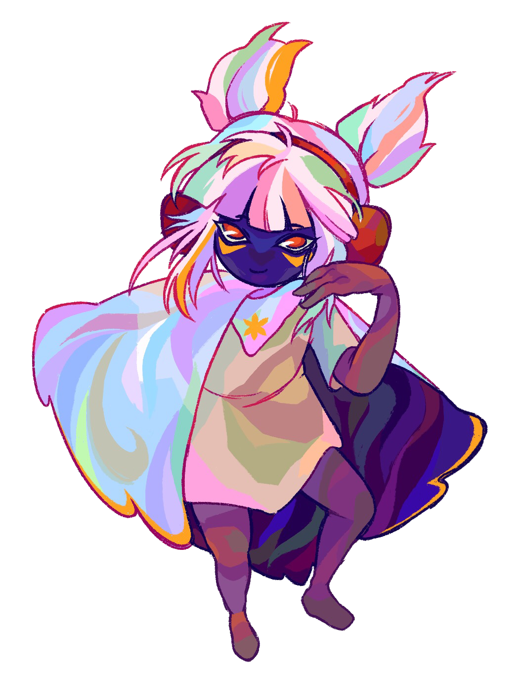


Mor creates art with striking uses of color, with every nook and cranny rendered in eye-catching forms.
Mor uses color anomalies and irregularities to add visual interest and texture.
#Persona5 pic.twitter.com/nNp3G7NPHB
— Morcat @ comm waitlist closed (@asfodeltide) April 14, 2023
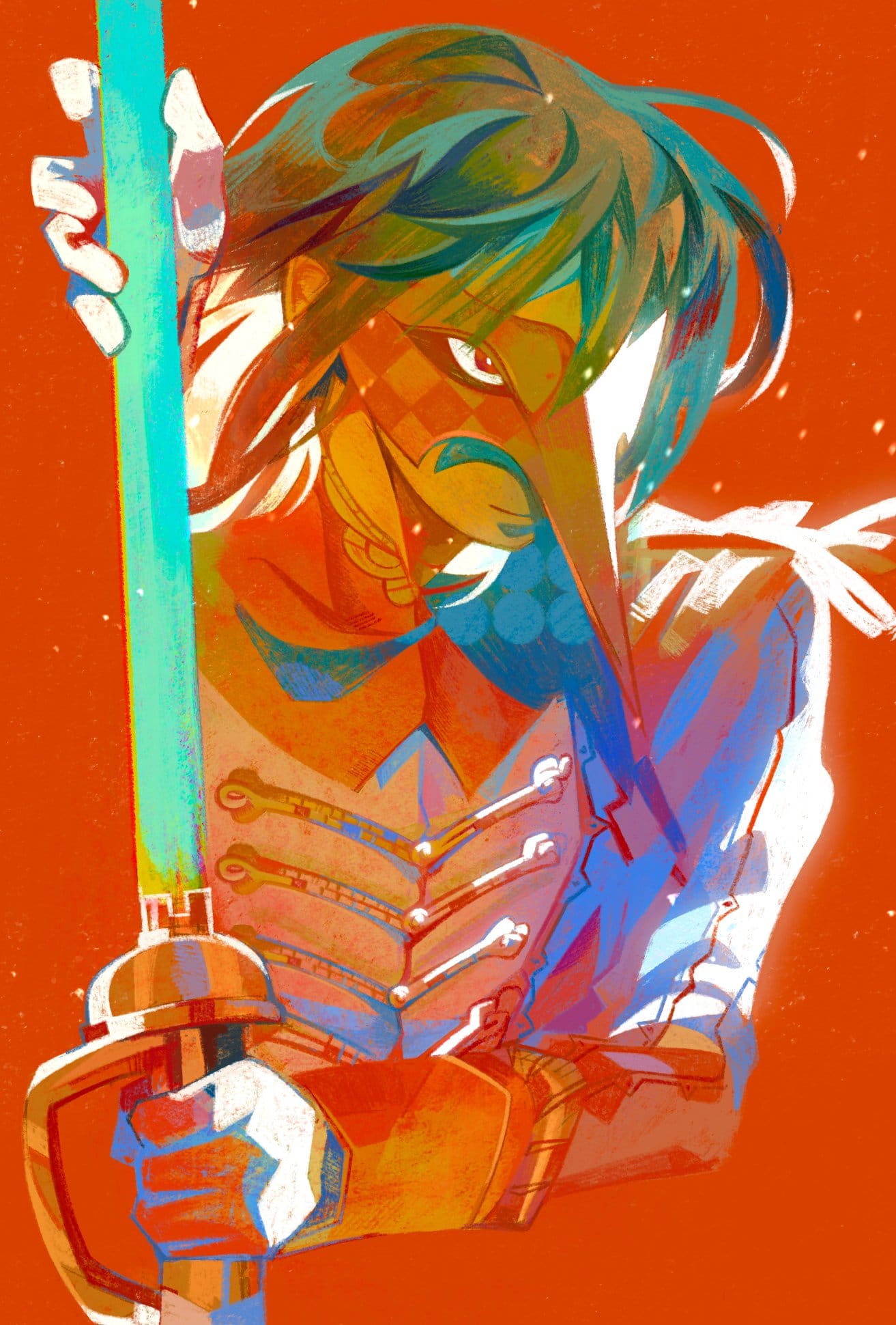
This visually-arresting portrait uses the striking complementary colors of orange, blue and teal
Another technique is that local color (hue) doesn't matter so much, but the value (how much light/dark) is what matters. The value helps to convey the interaction of light with the object as well as its form.
One of my favorite pieces is this paid commission that Mor created for me.
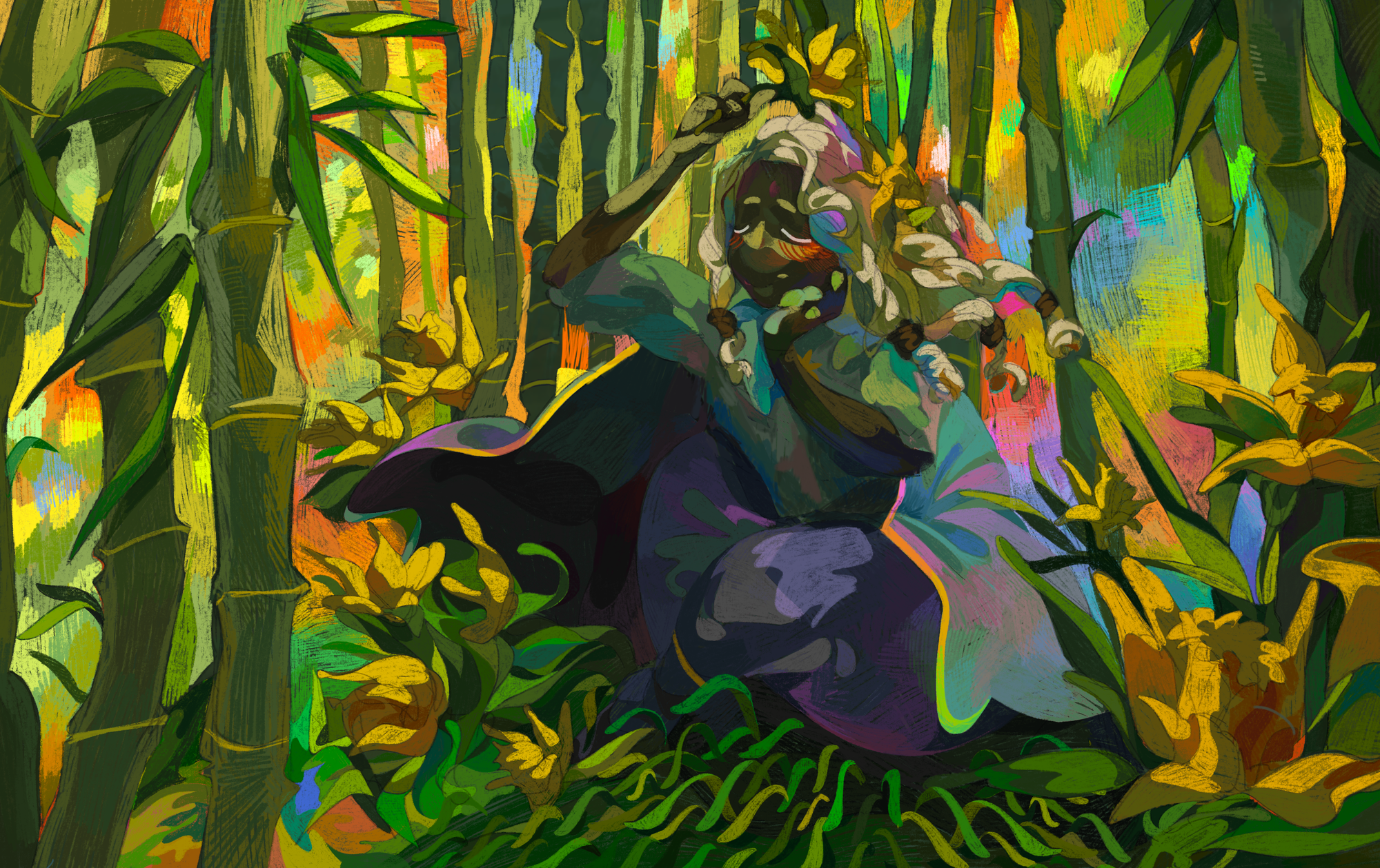
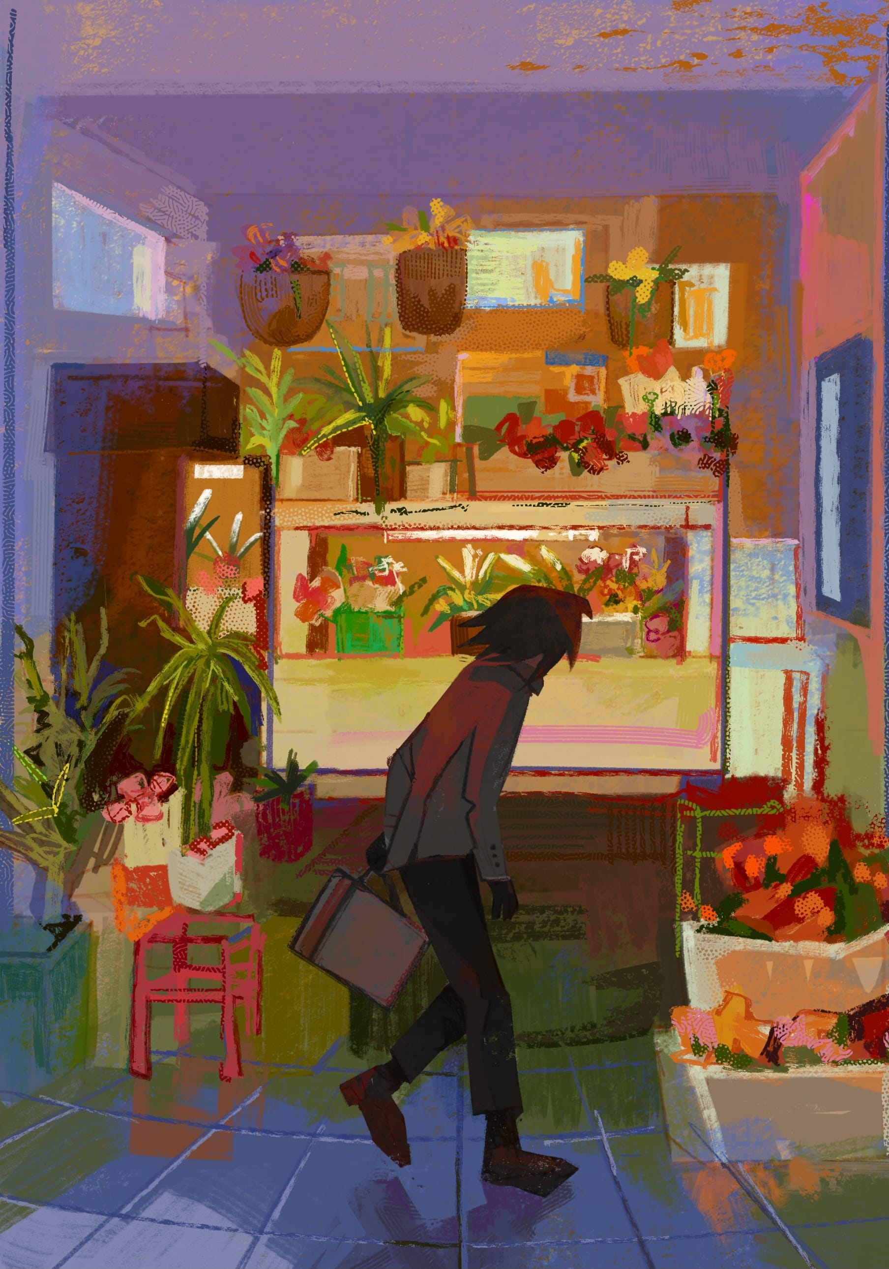
Another beautiful earlier piece that Mor did for me (which I paid for after) is this one. Mor has also created this piece which I use a lot: